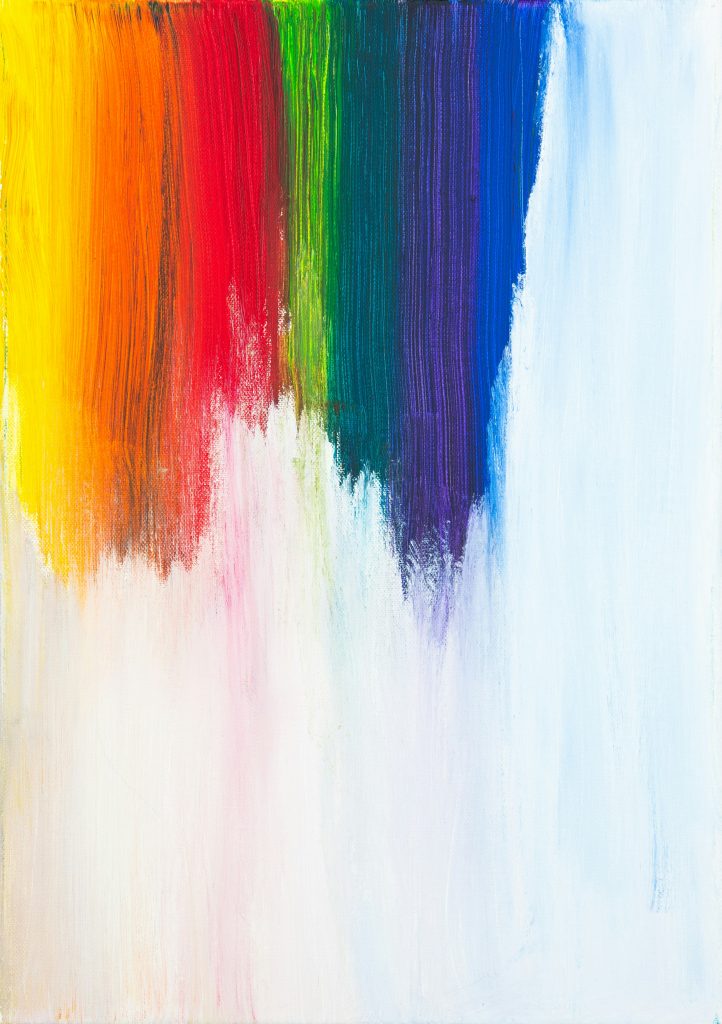
In this blog, I will be talking about the color trends of 2024 and the color that suits your website.
Introduction
Every website needs a unique color in order to get attention from the viewers of the website. The different shades that are used in your website play a very big role. If the type of shade is visible and easy on the eyes then the viewer will have no problem reading the text on the website. But if the website has very bold and dry shades that are not very attractive then the person who is viewing the site will be very unhappy due to the readability challenge they have to face.
Shade Theory
The shade theory was fully developed by Isaac Newton in 1666. When Isaac Newton was doing experiments with prisms he saw the white sunlight, and when the white sunlight was passing through the prisms, it started changing into different shades. Newton did not create the shade wheel but the work he did with the light gave a development of the shades concept. Newton found out that the primary colors of light are red, blue, and green. These shades can be combined in different ways and a new type of shade can be created.
Newton’s experiment also explored how different shades combine. Newton discovered this by combining different light shades and other lights that could be created from that. Newton recognized that a type of shade is a result of how lights interact with humans and how our brain and eyes explain the interaction.

User Experience
An eye-catching pallet has the ability to raise the website from “great” to “best” and I think if the colors are well chosen then the website can have more traffic. The main reason for choosing the correct pallet is to elevate the design of the website and level up the user experience. When a user is surfing the website then it’s the designer’s job to add a very outstanding hue to the website. If the pallet does not have an attractive shade then it can ruin the experience for the users.
“Several studies reveal how colors affect emotions, which is why many companies apply shade psychology to influence the actions and reactions of their target audience.” – Pushkar Timsina
Different Company Colors
Most companies use neutral shades as their primary color because they know the psychology of the type of color they are using. For example, Apple and Samsung have their neutral colors such as grey and blue. The logos for these companies are neutral because they understand that if the pallet is neutral then the customers will have no problem while observing the website of the company.
My advice for the reader is that, make sure your pallet matches the company’s description. For example, if you have a tech company then the pallet should include modern and clean designs using white, black, and grey. Modern and clean design schemes are important because they reflect innovation and progress and often portray cleanliness and efficiency.
When choosing a pallet for a sports company the right tone is always important and it should portray energy, passion, and excitement. So, when you choose a color for a sports company you should use a type of shade that represents energy such as red. Green and yellow would also work because green represents growth, nature, and vitality, and yellow represents optimism and enthusiasm and all of these colors are very vibrant and are best for sports.

Conclusion
In conclusion, when deciding on a color pallet make sure to see what different shades represent and how it portrays your website for your company. Learn the theory of colors with the shade wheel and find the best matching color for the company. And if you own a website be aware of the scams.

